Data visualization is always about evolving new ideas and taking advantage of new technologies.
Tableau, PowerBI and other tools are great for some types of data visualization, but I wanted to better visualize multi-dimensional data.
Using some Javascript libraries, I built a quick tool to parse and view “many-to-many” datasets and show them in three dimensions. (Many-to-many datasets might include: transactions between countries, relationships within social networks, or website traffic.)
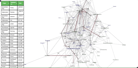
The “creator” version of this tool is used to parse and filter raw datasets. It isn’t ready for public release, but I wanted to show some data in the “viewer” version. For example, I looked at the flow of refugees between different countries.
Once you’re on the live version:
- Be sure to click around the viz and zoom around.
- You can click the “rotation” button and see the structure rotate. if you’ve moused around already, you might want to hit reload before using the rotation functionality.
A couple things to note:
- You can see that this view represents a lot of complex data in its entirety. This sort of visualization is overkill for many types of data. For example, in many situations a simple line graph might suffice.
- This isn’t meant to be something that I drop into an executive’s Powerpoint and walk away. This is more of a working tool that I can use to use to explore the data. Any insights I discover would be distilled into more accessible line charts or other visualizations.
- A 3D graphic takes more time and mental cycles to digest. There is a lot of data encoded within this visualization and we’re not used to it.
- By visualizing information in this way, it’s possible to identify relationships and connections that would be difficult to see in other visualization options.
- Many visualizations (including this one) can be more powerful when paired with companion data. For example, I include a simple table so I could parse the information better.
About the underlying tech:
- This is an alpha version that is hosted on GitHub pages.
- This was made with 3d-force-graph and Dataframe.js.
- When hosted in a standalone website, this visualization can be embedded in Tableau or other tool. This would help tell the story more comprehensively.
- Since this is built with Javascript, there are dozens of other frameworks that can probably show a similar view. There is also great tooling available in Python.
I’ll continue to evolve this tool and other projects. Feel free to hit me up on LinkedIn.